Household Views
I took these photos in 2020 to express how coronavirus was impacting me as a higher-risk young person. Early in the pandemic, I obsessively checked statistics and felt as though these statistics followed me everywhere as I tried to do my daily tasks. I used a projector to project graphs representing the pandemic around my home recreate this feeling visually and to find a new way to photograph such a familiar environment by focusing on the forms of the graphs and how they complemented the space.

Basement View of Global Coronavirus Cases, 2020, digital photograph
[Image Description: A graph of coronavirus cases projected over a corner of a cement room with a plastic shelving unit containing household items. A roll of plastic sheeting dangles limply from the top shelf, casting a shadow that connects it with the rising bars of the graph. The bottom of the graph reads “Jul Sep Nov,” but the numbers of the graph are heavily distorted and illegible, intermingling with the abstract shadows cast by the contents of the room. In the top left corner is a small window covered with crinkled silver insulation, the texture uniting it with the plastic roll and the graph.]
Basement View of Global Coronavirus Cases includes projected data which was originally sourced from Johns Hopkins University on November 2nd, 2020.

Bedroom View of United States Coronavirus Deaths, 2020, digital photograph
[Image Description: A bed is illuminated only by a bar graph which is distorted against the shape of the bed. The steep slope of the graph mirrors the raised head of the adjustable bed. The title of the graph reads “New reported deaths by day in the United States,” and at the center of the photo is the text “Many deaths from unspecified days” pointing at a particularly high bar. The bed has a laptop desk and satin pillow on it, and the screen of the laptop is reflecting some of the data.]
Bedroom View of United States Coronavirus Deaths includes projected data which was originally sourced from The New York Times on November 2nd, 2020.
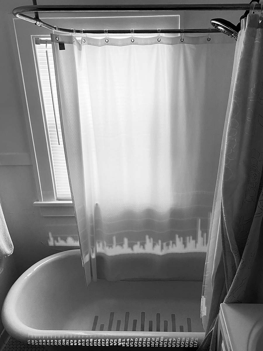
Bathroom View of Minnesota Coronavirus Deaths, 2020, digital photograph
[Image Description: A graph of coronavirus deaths projected over a bathtub and shower with the dates of the deaths lined up along the rim of the tub. The graph is distorted by the tub, so the white bars of the graph appear on the curtain, echoing the shape of the tub treads. Natural light comes in from the window and is diffused through the shower curtain. The light also highlights the window frame and sill, which runs parallel to the subtle white lines on the curtain marking the number of dead.]
Bathroom View of Minnesota Coronavirus Deaths includes projected data which was originally sourced from the Minnesota Department of Health on November 2nd, 2020.

Kitchen View of Global Coronavirus Cases, 2020, digital photograph
[Image Description: A kitchen sink surrounded by wooden cabinets, with a projected map of the world overlaying the ones below the sink. The map is covered with circles representing the amount of coronavirus cases and in many places the circles are so densely packed the entire area is white. The light from the window above the sink is diffused by curtains assembled from white dish towels. The lower tier of curtains are patterned with groups of round cherries surrounded by leaves. At the far left, and there is a stack of mixing bowls and other kitchen items on the counter below a cabinet that was left open, revealing dishes inside.]
Kitchen View of Global Coronavirus Cases includes projected data which was originally sourced from Johns Hopkins University on November 2nd, 2020.